For the first time in my creative journey, saying “because I like it” was not a sufficient answer when I was questioned about my reasons for using the colour blue in my work. “It’s just a nice colour” I thought to myself, as I stubbornly ordered books on amazon, borrowed library books and researched the history of Blue on the internet.
I was surprised to find that the world’s most favorite color is blue. Studies conducted over the years show that nearly 40% in men and 30% in women are drawn to the colour blue. Let’s face it we have all owned or owned something blue by choice, from your favourite piece of denim to that random blue shirt in the back of your wardrobe. However, blue is surprisingly hard to come across in nature
When you think about blue in nature the first thing you think about is probably the sky or the sea right? Maybe a blue jay or the common bluebell for those nature enthusiasts. Maybe you even thought about the Blue Whale which is not actually blue, it’s just names after the colour.
In Britain and some other countries, brides often wear “Something old, something new, something borrowed, something blue” which symbolises loyalty and faithfulness. Blue sapphire engagement rings are considered a symbol of fidelity. Blue is often used in hospitals, places of healing and is often associated with excellence and royalty. Which is why the Queen of the United Kingdom often wears a blue sash on formal occasions and the highest award in county fairs and competitions in the United State is in fact the Blue Ribbon.
With all these little facts I discovered on my brief search through the internets, my intrigue in the colour blue grew and I began to firmly grasp why artists such as Yves Klein and Picasso were so fascinated by it. So I continued to read about it and immerse myself in its history.
Most tribes around the world have no words to describe the colour blue and it is believed that early humans had no concept of it. Literature such as Homer’s Odyssey reflected this by describing the ocean as “wine-red sea.”
It is known that the Ancient Egyptians were the first to create a blue pigment which was often used in their art. Egyptian Blue is considered to be the first synthetically produced colour pigment which was created around 2,200 B.C. Egyptians created this pigment by mixing ground limestone, sand and azurite or malachite which are copper-containing minerals and heated 1650°F which resulted in an opaque blue glass. The glass was crushed and thickened by mixing egg whites which made for a long-lasting paint.
Blue was held at a very high regard by the Egyptian and was used to decorate various ceramics and even tombs of pharaohs. Blue continued to be popular throughout the Roman Empire until the end of the Greco-Roman period. Blue continued to evolve over the years and so did the methods used in it’s production
Fun fact: Discovering colour on ancient artifacts was made much simpler in 2006 as Egyptian blue was found to glow under fluorescent lights. This indicates that the pigment emits infrared radiation
My Favourites Blues and why
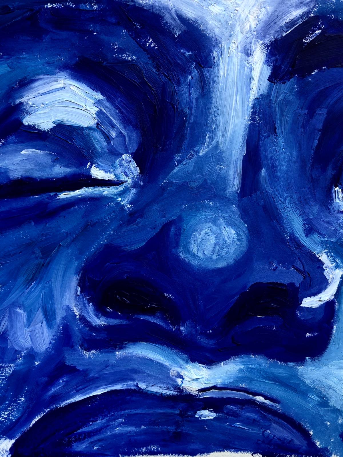
Of all the blues I’ve come across I find that Prussian Blue and Ultramarine Blue are two shades/forms of blue that fit in line with my work, they allow me to portray a depth that no other colours carry. And not only do they bring out a depth in my work, understanding the early insignificance as well as the rarity of blue as a colour, it has led me to make links and comparisons to race as there was once a time that the black race was considered insignificant and over time i’ve come to understand how unique we are as beings.
Another Fun Fact: animal blood accidentally came into contact with his materials as Johann was trying to create a new red. The reaction resulted in the creation of vibrant blue rather than the intended red
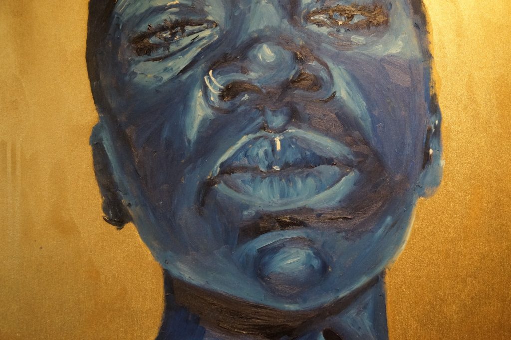
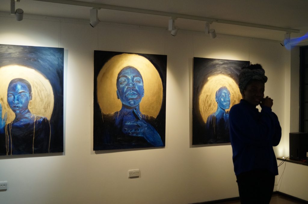
In my paintings I focus on immortalising people of colour, particularly women, who often fall in line with negative stereotypes created by society. I use the blue in my paintings to symbolize peace, trust, strength, loyalty and wisdom. My paintings depict a softness and gentle relationship to the black woman that is not often represented socially.
Prussian Blue and Ultramarine blue are the two colours I predominantly use in my work. I believe they have a depth to them that no other colours carry. The early insignificance of blue and rarity of it allowed me to make links with race as there was once a time that black people were so greatly insignificant and how unique we are as beings. The blue in my paintings symbolizes peace, trust, strength, loyalty and wisdom. And I couple this with painting people of colour, particularly women, who often fall in line with negative stereotypes created by society. My paintings depict a softness to black women and a gentle relationship that is not often represented socially.
In conclusion, blue is awesome.
Written by Angela Chilufya.